Ethan Marcotte wrote an introductory article about the “Responsive Web Design” approach for A List Apart. It stems from the notion of responsive architectural design, whereby a room or space automatically adjusts to the number and flow of people within it: “Recently, an emergent discipline called “responsive architecture” has begun asking how physical spaces can respond to the presence of people passing through them. Through a combination of embedded robotics and tensile materials, architects are experimenting with art installations and wall structures that bend, flex, and expand as crowds approach them. Motion sensors can be paired with climate control systems to adjust a room’s temperature and ambient lighting as it fills with people. Companies have already produced “smart glass technology” that can automatically become opaque when a room’s occupants reach a certain density threshold, giving them an additional layer of privacy.”
Adjusting Screen Resolution
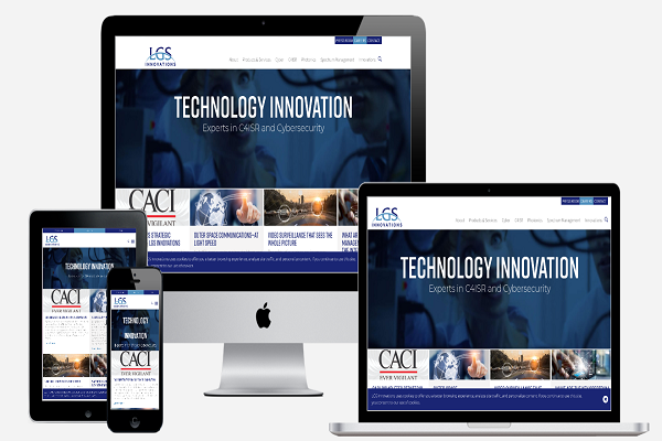
With more devices come varying screen resolutions, definitions, and orientations. New devices with new screen sizes are being developed every day, and each of these devices may be able to handle variations in size, functionality, and even color. Some are in landscape, others in portrait, still others even completely square. As we know from the rising popularity of the iPhone, iPad, and advanced smartphones, many new devices can switch from portrait to landscape at the user’s whim. How is one to design for these situations?
In addition to designing for landscape and portrait (and enabling those orientations to switch instantly upon page load possibly), we must consider the hundreds of different screen sizes. Yes, it is possible to group them into major categories, design for each, and make each design as flexible as necessary.
Part of the Solution: Flexible Everything
A few years ago, when flexible layouts were almost a “luxury” for websites, the only loose things in a design were the layout columns (structural elements) and the text. Images could easily break layouts, and even flexible structural elements broke a layout’s form when pushed enough. Moreover, flexible designs weren’t that flexible; they could give or take a few hundred pixels, but they often couldn’t adjust from a large computer screen to a netbook.
Now we can make things more flexible. Images can be automatically adjusted, and we have workarounds so that layouts never break (although they may become squished and illegible in the process). While it’s not a complete fix, the solution gives us far more options.
Showing or Hiding Content
It is possible to shrink things proportionally and rearrange elements as necessary to make everything fit (reasonably well) as a screen gets smaller. It’s great that that’s possible, but making every piece of content from a large screen available on a smaller screen or mobile device isn’t always the best answer. Again, we have best practices for mobile environments: more straightforward navigation, more focused content, lists, or rows instead of multiple columns.
Responsive Web design shouldn’t be just about creating a flexible layout on a wide range of platforms and screen sizes.
Summary
Hopefully, reading this has taught you a few new tricks and uncovered some of the more obscure options within Photoshop. While memorizing shortcuts can be a chore, integrating them into your daily workflow can save you an incredible amount of time.
Teluguwap offers a diverse range of Telugu music, movies, and more, making it a go-to platform for Telugu entertainment enthusiasts. With its user-friendly interface and vast collection, it provides a convenient and immersive experience. Whether you are a fan of classic melodies or the latest blockbuster hits, Teluguwap has got you covered.